10-B: Final free choice project reflection may 30th, 2013
1.) My project is a Drawind. I used markers, chalk pastels, and pencil. I worked on this ouside of class for about 2 hours total in two weks. I did most of my work in class.
2.) I think the strong parts are the color and writing on the drawing because the writing is really neat and the color contrasts well.
3.) I think what I could have done better was added a more detailed background. I think this because eventhough it contrasts well and looks good its kinda plain.
4.) My theme was love. I think that the quote on my drawing are very true. I think that I was trying to comunicate the value of love because its important to me.
5.) I think My most imporant elements are color and value. I think this because The colors contast well and the shading blends well
6.) I thing that the two most inportant principles are pattern and contrast. I think this because my colors go all in the same order and my colors contrast with the lettering.
7.) I think that I learned that decision making is hard but there is always a cle to the right decision.
8.) First I decided to look on the internet. When I found out what I wanted to do I had to decide on if it would be a painting or a drawing. I had originally had the plan of ppainting something different, but decided to do a drawing in the end. after I had sketched it out I decided that I wanted it to be a drawing. when I had finished inking the words i did the background in light colors.
9.) I didnt plan on doing the project i did. I had planed on painting something different but changed it right before we started the projct. I enede up changing a lot more than just the painting to a drawing. I like the drawing i eneded up with in the end.
10.) I think this was a worth while project because it let all of us feel like we had some freedom in our artistic ability. I will probably eng up doing some photography here and there this summer.
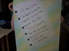
This is the over all of my drawing with the saying by johnny depp on it
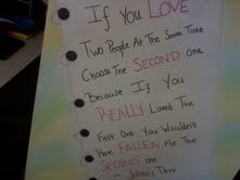
This is a close up of the words and colors
|
I like the arial affect this picture has. its a nice way to show all the words and colors.
|
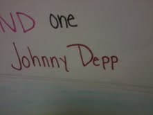
I think Johnny Depp is a very clever man.
|
